

Each year in health class, we study the importance of healthy eating and exercise. Our class recently reviewed the Canada Food Guide and a PowerPoint presentation about nutrition labels.
http://www.hc-sc.gc.ca/fn-an/food-guide-aliment/order-commander/eating_well_bien_manger-eng.php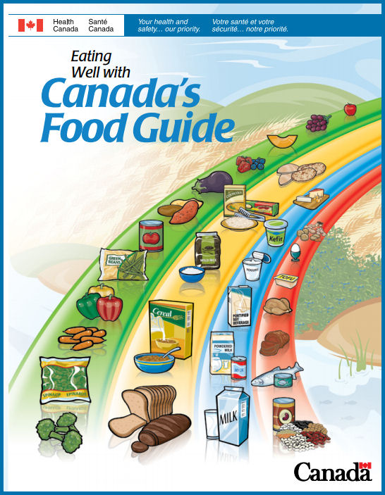
http://www.hc-sc.gc.ca/fn-an/label-etiquet/nutrition/educat/info-nutri-label-etiquet-eng.php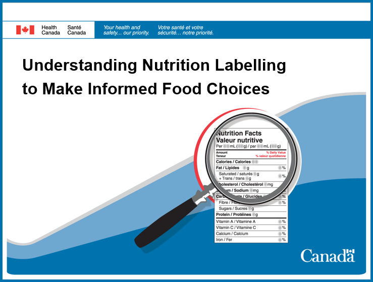
We were curious about the sugar and salt content of prepackaged foods and drinks that students bring to school for lunch. After one of our nutrition breaks we collected a random assortment of packages that had nutrition labels, from classroom garbage and recycling bins.
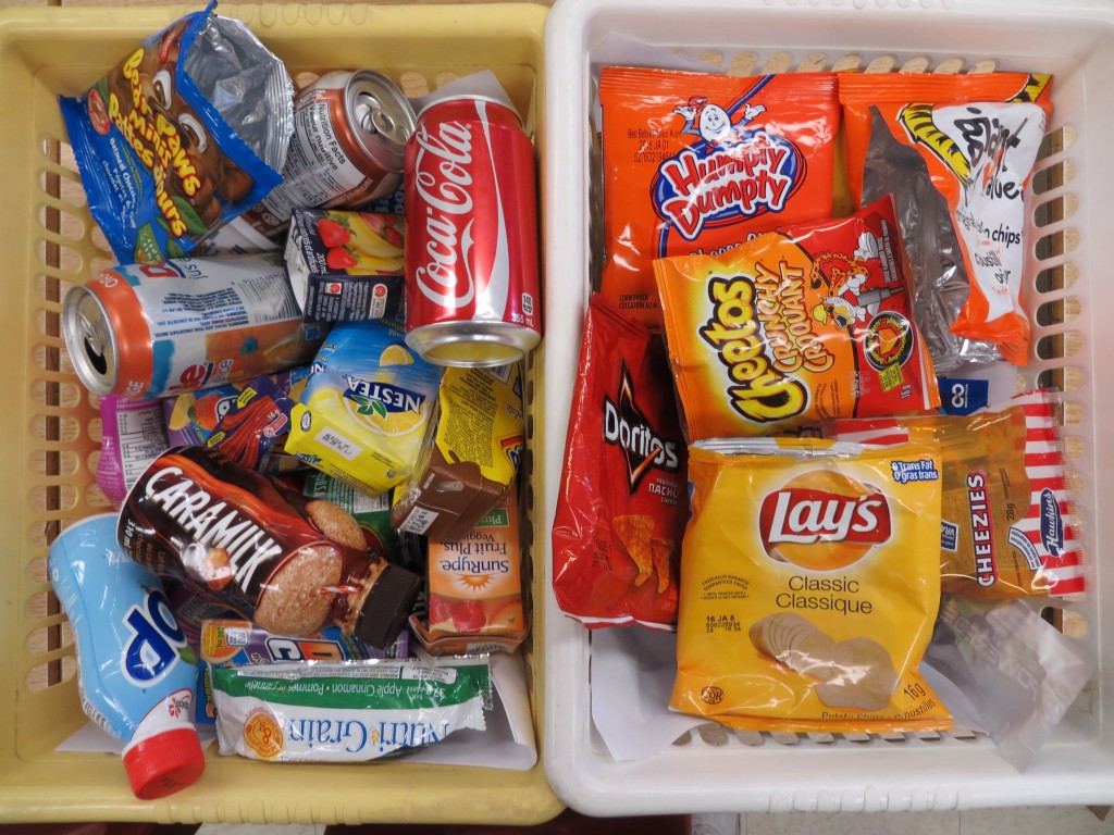
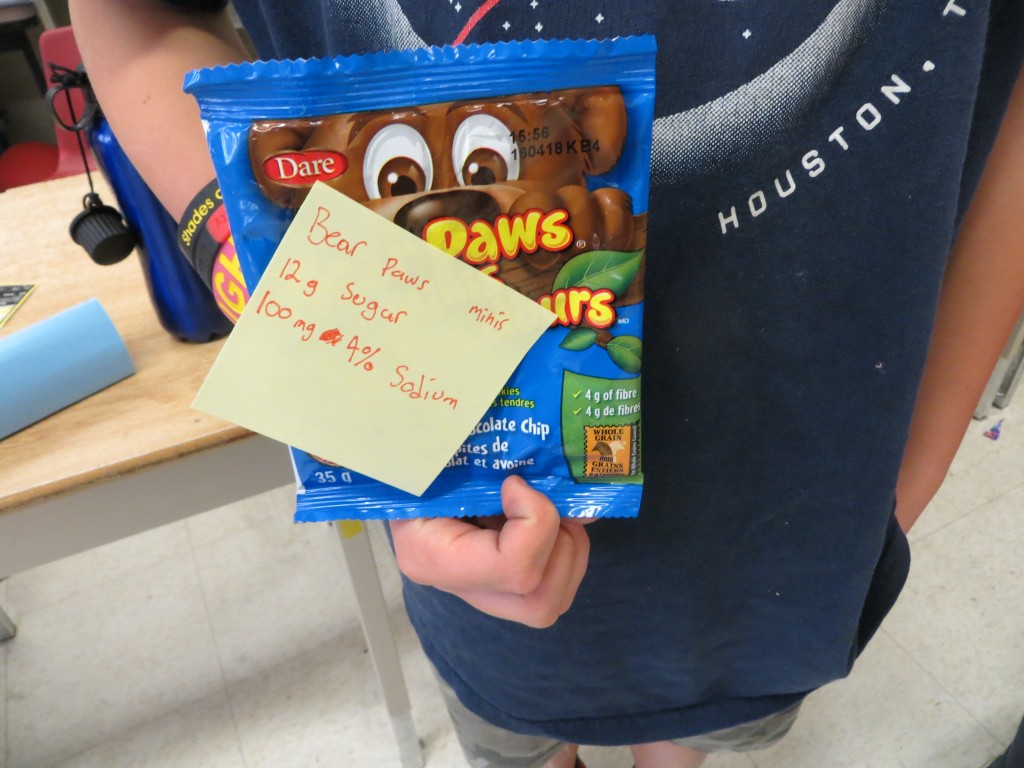
We examined the sodium content of salty snacks, in small, Halloween-sized bags. Most of the potato chip, Dorito and cheezie bags contained between 95 and 110 mg of sodium. This represents 5% of the Daily Value for sodium.
We compared the sodium content of the chip bags to that of a "Lunchable." We were shocked to find that the Lunchable contained over five times as much sodium as the chips... or 23% of the Daily Value for sodium!

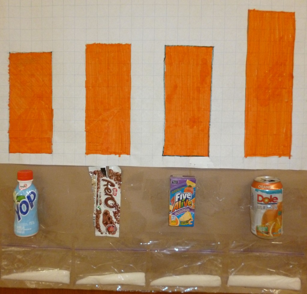
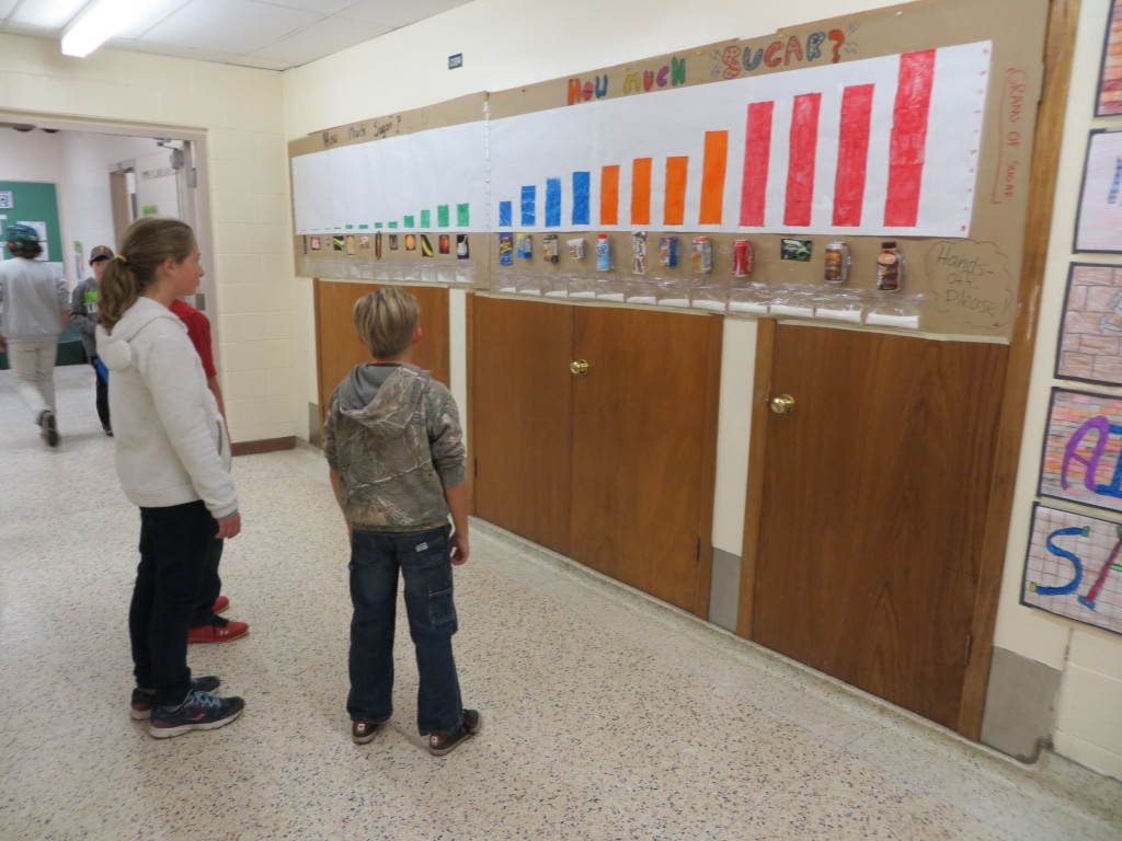
Next, we examined the sugar content of "sweet" treats, and ranked several items in order of sugar content.

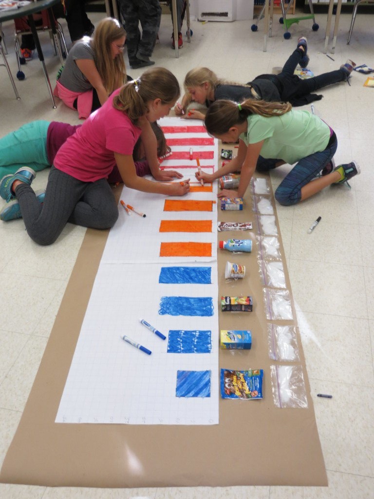
Then, we graphed the sugar content of twelve sweet snacks that students had brought to school for lunch.
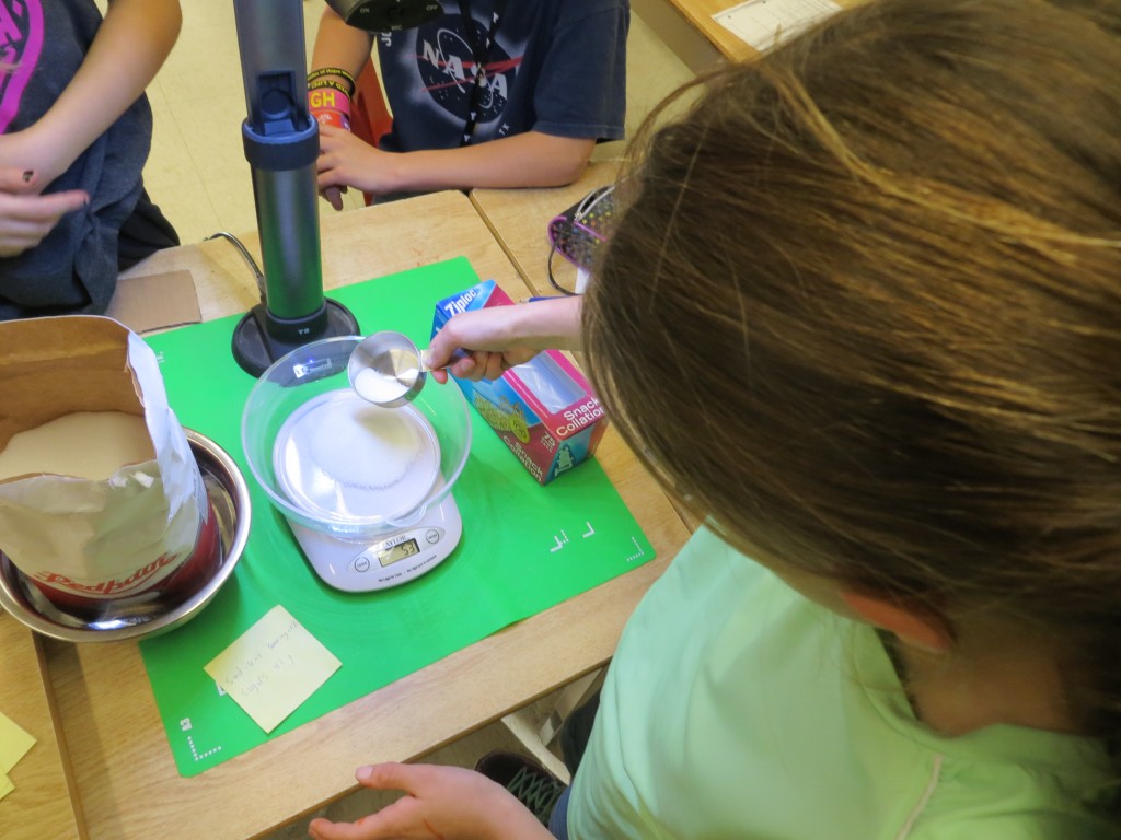
 While some students were drawing and colouring the graph, others weighed granulated sugar to approximate the amount of sugar in each snack. We bagged the granulated sugar and attached it to the graph.


 The ranking of some of the items and the large quantity of sugar in the bags surprised everyone!

 We mounted the graph in the hall outside our classroom. It became an instant conversation piece for students in our class, and for those passing through our hallway!


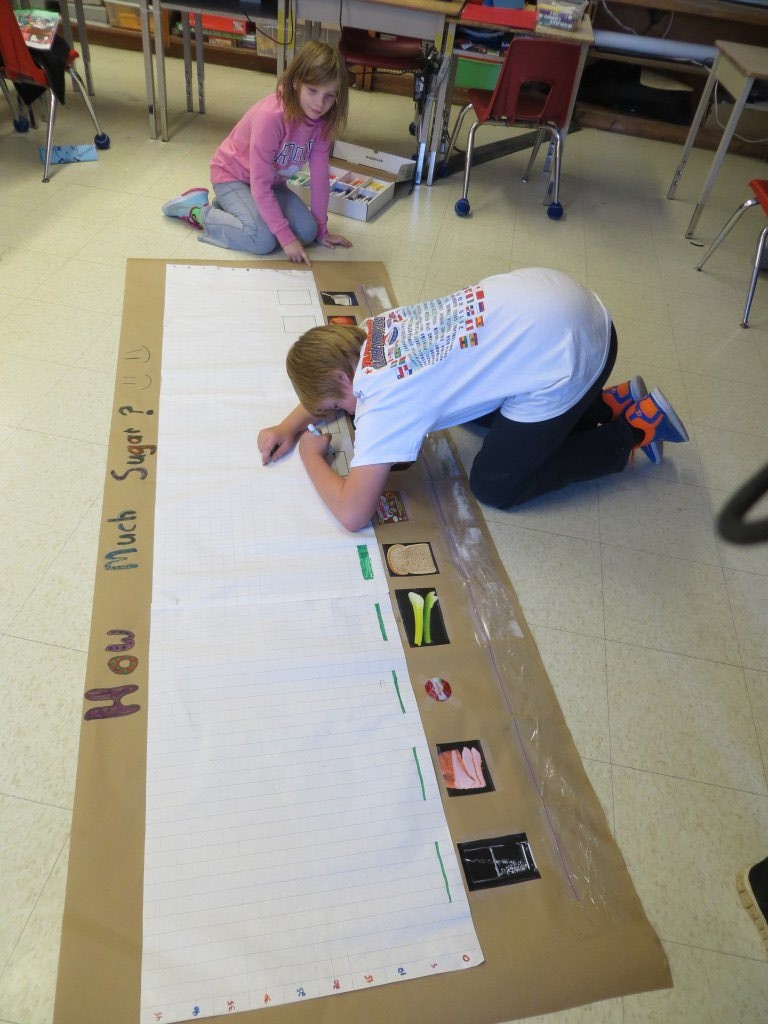
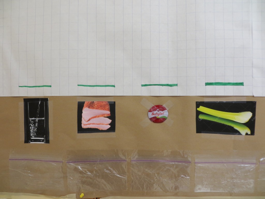
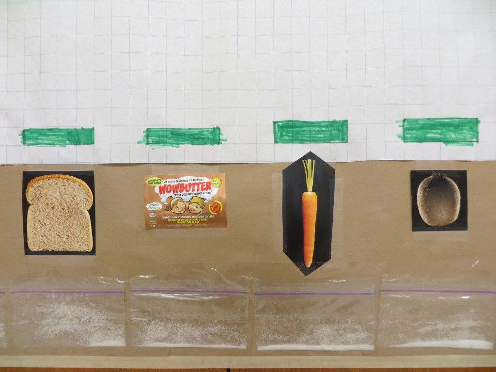
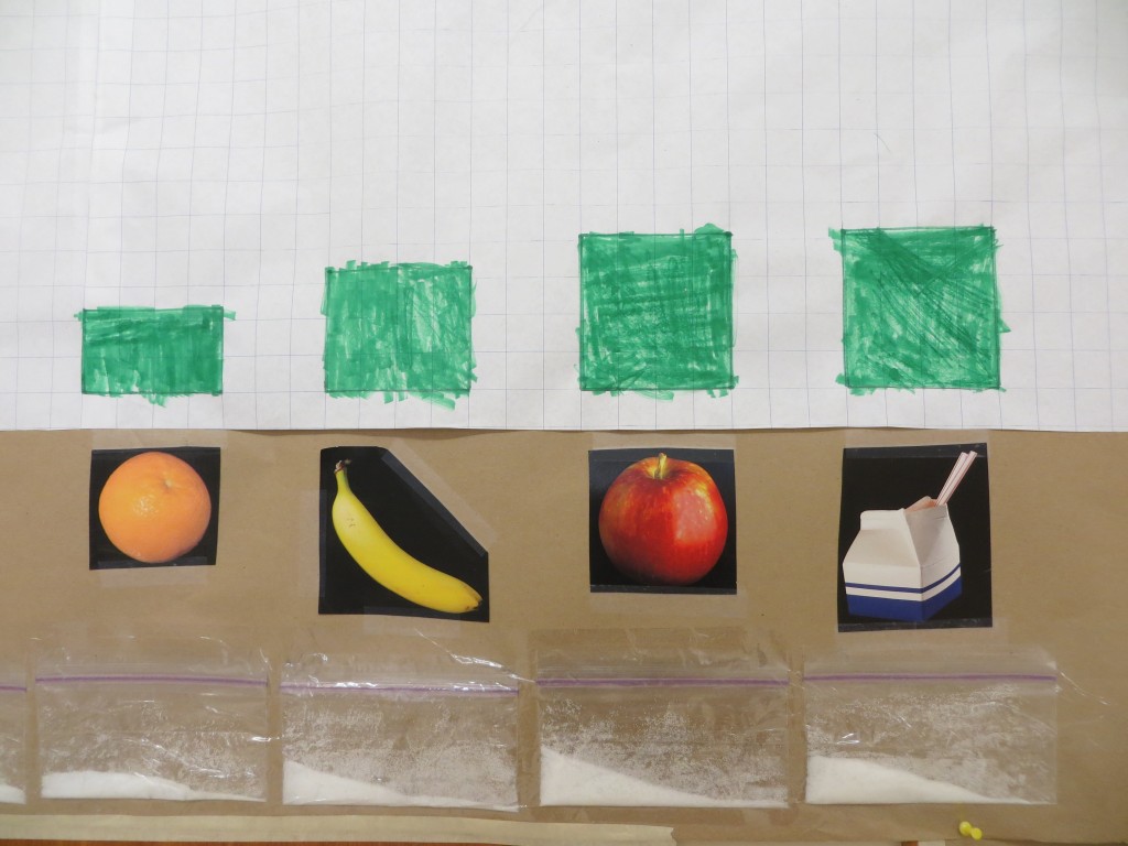
During our next health lesson, we decided it might be a good idea to examine the sugar content of healthier school lunch items, and graph them as well.
The "healthy food graph" gave our class and passersby some extra data to consider. These are Grade 5 and 6 students discussing the graph on their way in from recess.
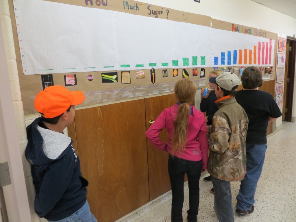
This is a Grade 1 class discussing the graph. They are also studying nutrition right now.

We discussed the fact that, although we represented sugar content for all items using granulated white sugar, the sugar that is present in most of the items on the healthy food graph are natural sugars, rather than manufactured sugars that were added to make food and drinks more appealing.
Students in our class felt our graphing activity was an eye-opening experience. Here are some of their comments:
R.K.: I was shocked to find out how much sugar was in Powerade and chocolate bar flavoured milk. I thought Coke would be the worst.
B.T.: It’s unbelievable how much sugar can be in everyday foods!
B.L.: I agree. It’s amazing how much sugar is in everything we eat.
J.M.: Nobody really thinks about how much sugar and sodium they are intaking every day.
W.C.: I couldn’t believe how much sugar is in root beer. I thought Coke would be higher.
R.P.: Every day, every person thinks they are just drinking flavoured milk, but the Caramilk type has a ton of sugar in it.
E.G.: I think more people should stop to think what they are buying at the grocery store. They should be looking at the food labels, not just the advertisements about things being “high fibre,” etc.
C.B.: I had no idea that the Caramilk milk-thing had more sugar than pop!
J.C.: I wonder if a Caramilk chocolate bar has as much sugar as the Caramilk drink?
L.B.: I can’t believe that Powerade has more sugar than Coke.
S.T.: It’s surprising to me how much sugar could possibly be in a simple drink like pop.
K.P.: I think it was really surprising that the ham had no sugar in it, and I was really surprised that root beer has more sugar than Coke.
S.M.: I was really surprised that oranges had more sugar than carrots.
N.H.: I was surprised that apples have more sugar than oranges, because sometimes apples taste really sour.
M.M: What I eat is scary! 🙁
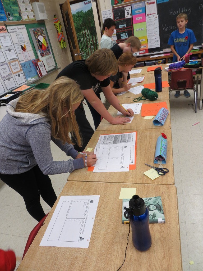
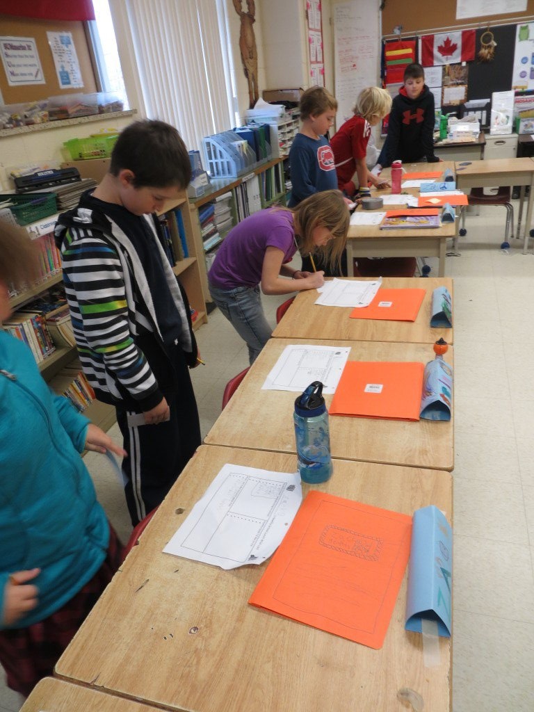
The next step in our nutrition unit involved discussing what constitutes a healthy school lunch item, and what could be defined as a less-healthy snack item. Students rated the lunches they had brought to school that day, according to how nutritional and waste-fee they were. Most students rated their lunches as moderately to highly nutritious; most rated their lunches as poor in the waste-free department. Students with waste-free lunches then provided tips to their peers about how to reduce school lunch waste.
Afterwards, each student made a list of the healthy food items they sometimes bring to school. Then they were given an opportunity to peruse others' lists and jot down new healthy school lunch items that they would like to try.


Hopefully, our graphing activity, and the conversations it inspired, will help students to really think about the food and drinks they are putting into their bodies, and to try some new healthy school lunch ideas!
-------------------------------------------
Thank you for visiting our class BLOG. If you have any questions or comments, feel free e-mail me (Margaret Black): mblack@scdsb.on.ca or to add a comment to this page.